Design
What does it look and feel like to use?
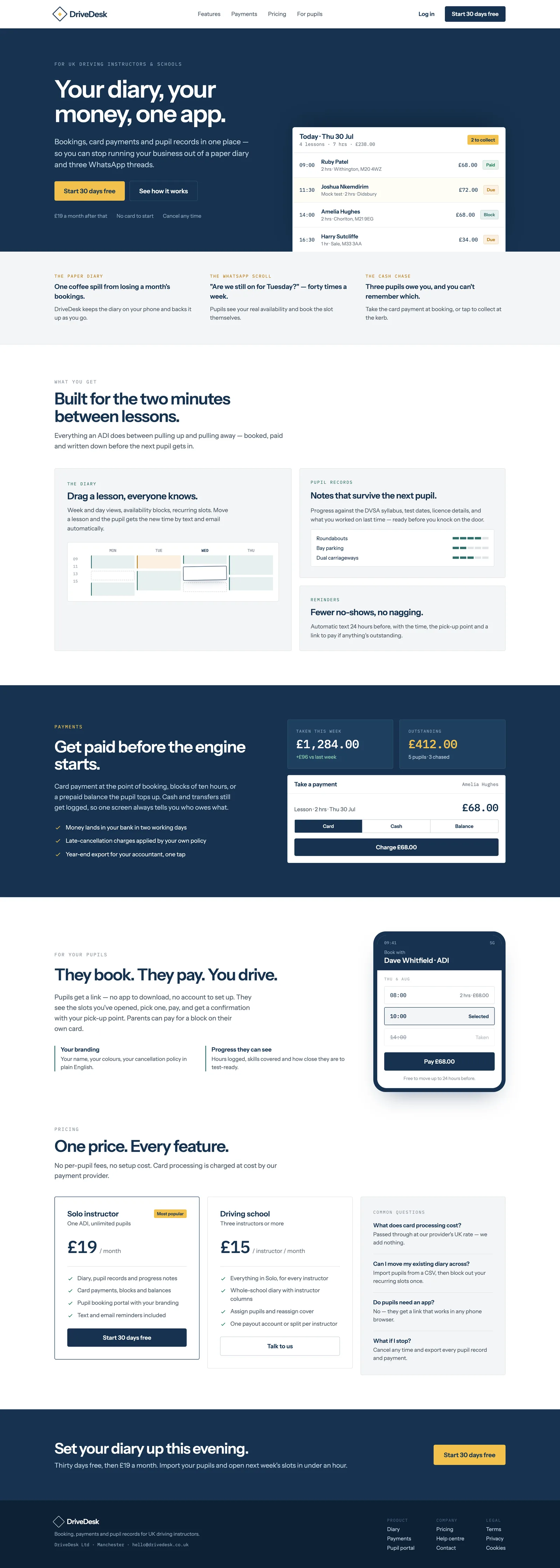
One product, two very different users: an instructor glancing at a phone roadside, and a pupil booking like any consumer app. Mobile-first, payment-status-driven, unfussy.
- Instructor surface
- A 'who's next' day list, not a month grid
- Pupil flow
- Invite link → slot chips → embedded Stripe sheet
- Signal
- Colour = payment status everywhere (green / amber / red)
- Brand
- Trustworthy and unfussy — one accent blue, no flashy-startup gloss
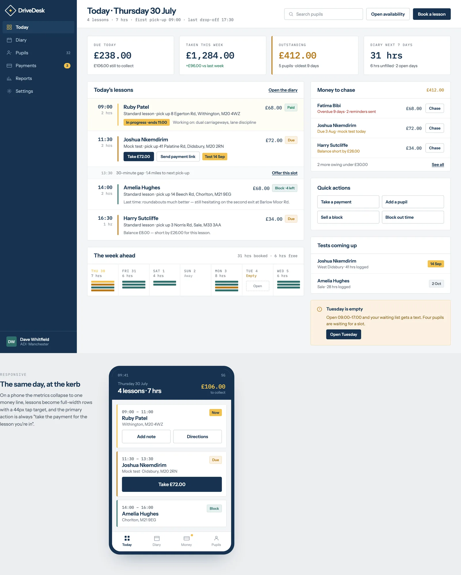
The instructor dashboard opens to today's lessons as a vertical list. Touch targets are 44px+ — this is used one-handed, often gloved, at the side of the road.
Green paid / amber pending / red no-show, used consistently across calendar, dashboard and earnings so a colour never means two things.
Pupil-facing screens use real uploaded photos or a plain initials avatar — never generic 'happy driver' stock. The audience is a working tradesperson, not a software buyer.
Design principles
DriveDesk has two very different users sharing one product: an instructor checking their phone between lessons, often one-handed, at the side of the road — and a pupil who is usually a teenager or young adult booking a lesson the same way they'd book anything else on their phone. The interface has to work at a glance for the instructor and feel as effortless as any consumer booking app for the pupil. Nothing in the MVP should require a desktop screen to use, though a desktop view is fully supported for school admins managing multiple instructors.
Key screens
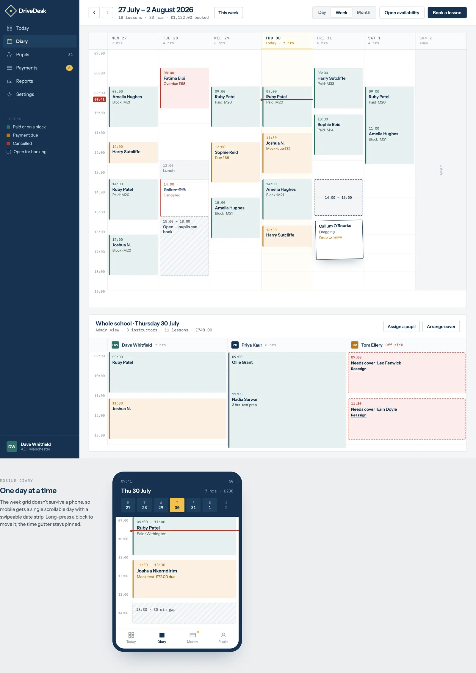
Instructor dashboard (mobile-first, also works on desktop)
Opens to today's lessons as a vertical list, not a full calendar grid — an instructor mid-week wants to know "who's next," not scan a month view. Each lesson card shows: pupil name and photo (if set), time, pickup location, lesson type (standalone or package), and a payment status indicator (paid / pending / package balance remaining). Tapping a card expands to show pupil notes from the last 2–3 lessons, so an instructor can refresh their memory in the seconds before pulling up. A single persistent bottom bar gives access to: Today, Calendar (week/month view), Pupils, and Earnings.
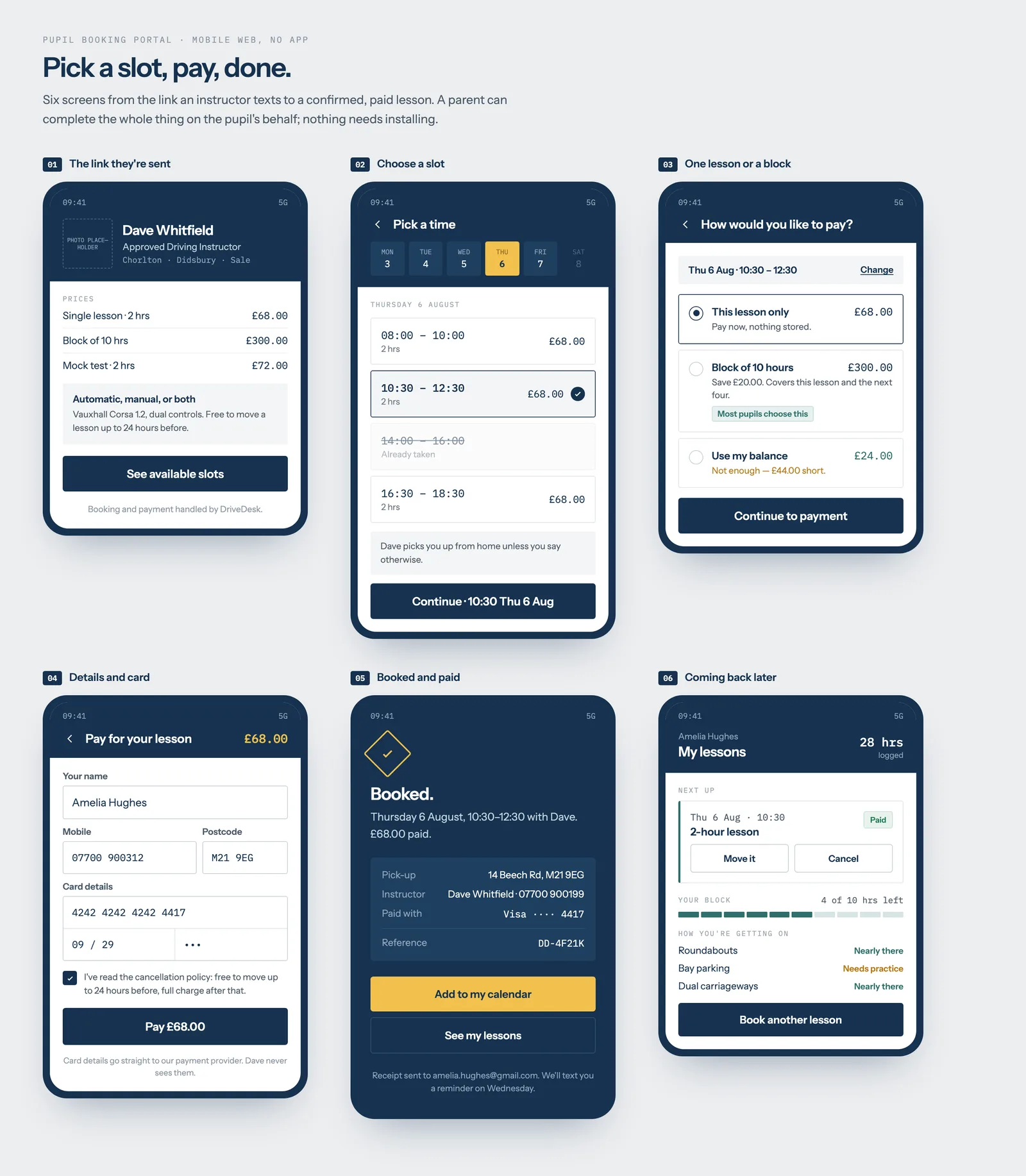
Pupil booking screen
A single scrollable page: instructor's available slots for the next 14 days, grouped by day, shown as tappable time chips (not a dense calendar grid — pupils are booking one lesson at a time, not managing a schedule). Above the slots, a persistent summary of the pupil's active package ("4 of 10 hours remaining") if applicable, or a single "Book & Pay" button if paying per-lesson. Booking a slot opens a lightweight payment sheet (Stripe Payment Element embedded, not a redirect) and confirms with a receipt and calendar-add prompt.
Calendar view (instructor and school admin)
Week view by default, day columns, colour-coded by payment status rather than lesson type (green = paid, amber = pending, red = no-show/unpaid) — payment status is the thing an instructor actually needs to scan for at a glance. School admins see the same view with an instructor-selector across the top, toggling between "all instructors" (stacked columns) and single-instructor focus.
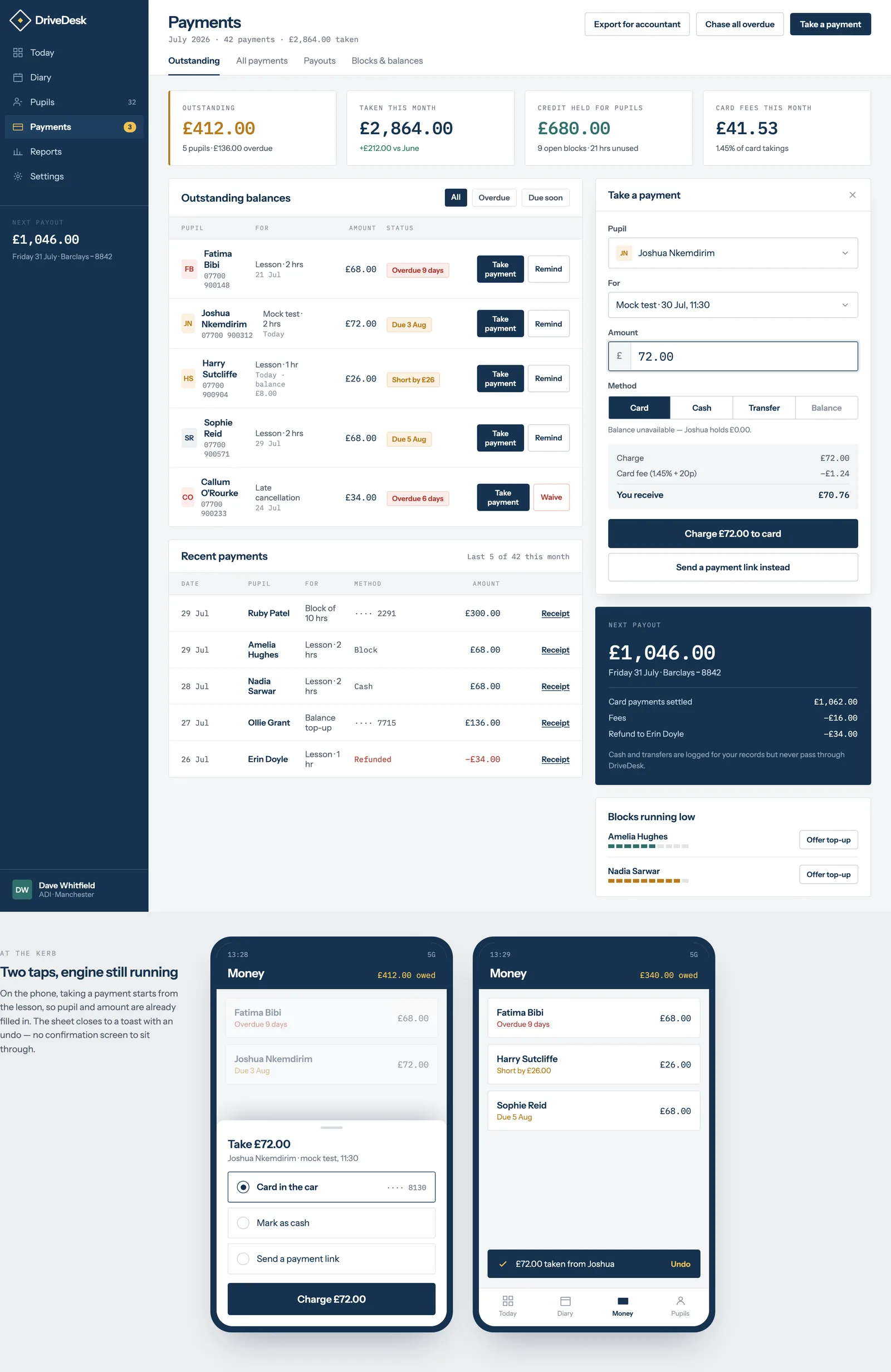
Payments & earnings screen
For instructors: a running total for the current week/month, a list of individual transactions with status, and a clear breakdown of Stripe's fee versus what lands in their account — instructors are sole traders managing their own income and want this transparent, not buried. For school admins: the same view aggregated across all instructors, with per-instructor payout totals for their own record-keeping (DriveDesk does not calculate tax or handle payroll — it surfaces the numbers, the school's accountant does the rest).
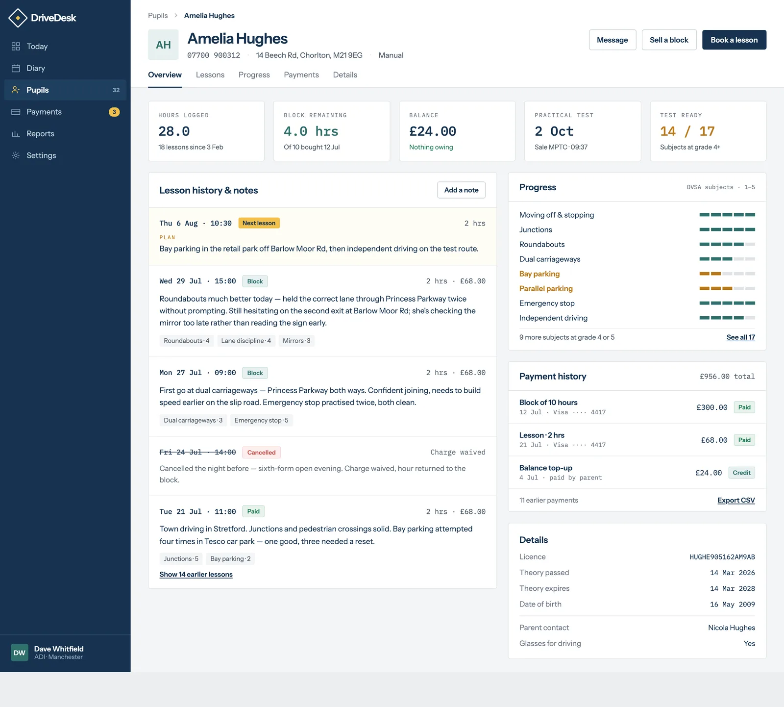
Pupil records & notes screen
A simple list of pupils (instructor's own, or all pupils across the school for an admin), each opening to a profile: contact details, licence status, lesson history with notes chronologically, and package/payment history. Notes are entered as plain text immediately after a lesson via a large single text field optimised for fast one-handed typing — no rich text, no required fields, because an instructor filling this in has 90 seconds between pupils, not five minutes.
User flows
Instructor invites a new pupil. Instructor taps "Add pupil" → enters name and phone number → DriveDesk sends an SMS with a booking link → pupil taps the link, lands directly on that instructor's booking screen, no app download or account creation friction beyond a phone number and a one-time code.
Pupil buys a package instead of paying per lesson. On the booking screen, pupil is shown package options if the instructor has one configured (e.g. "10 hours – £300, save £20") alongside the single-lesson price, encouraging upfront commitment without forcing it.
Cancellation. Pupil cancelling inside the instructor's configured window (e.g. under 24 hours) sees a clear warning before confirming — "cancelling now means you'll be charged in full" — rather than a silent charge appearing later. Transparency here is deliberate: unexpected charges are the single fastest way to generate a support complaint and a bad review.
Interaction notes
- All primary actions (book, pay, cancel, add note) are reachable in one or two taps from the relevant dashboard — no deep navigation.
- Payment status uses colour consistently across every screen (calendar, dashboard, earnings) so an instructor never has to relearn what a colour means in a different context.
- Empty states are written in plain language, not generic placeholders — e.g. a pupil with no upcoming lessons sees "No lessons booked yet — tap below to find a time," not "No data."
Brand & design system notes
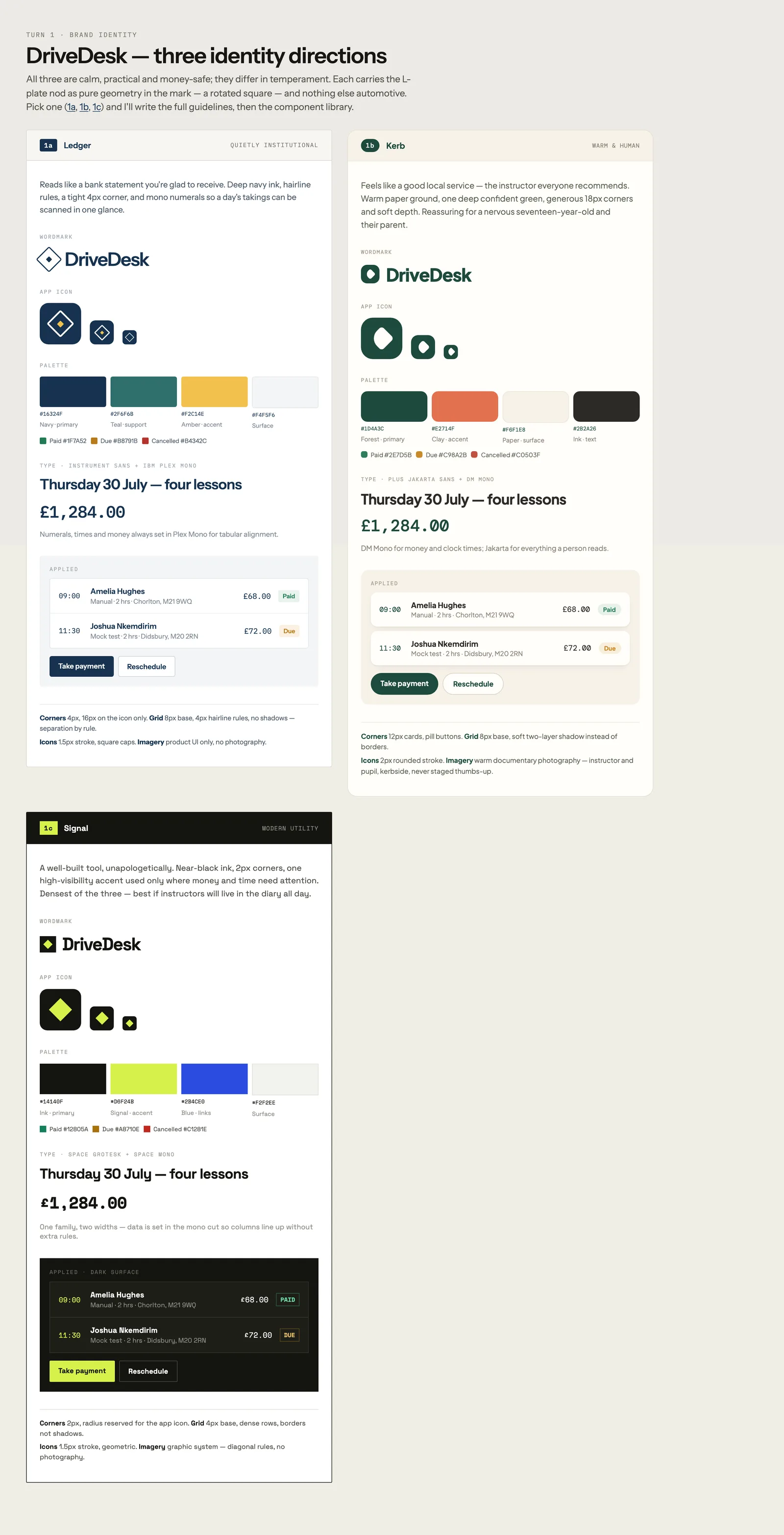
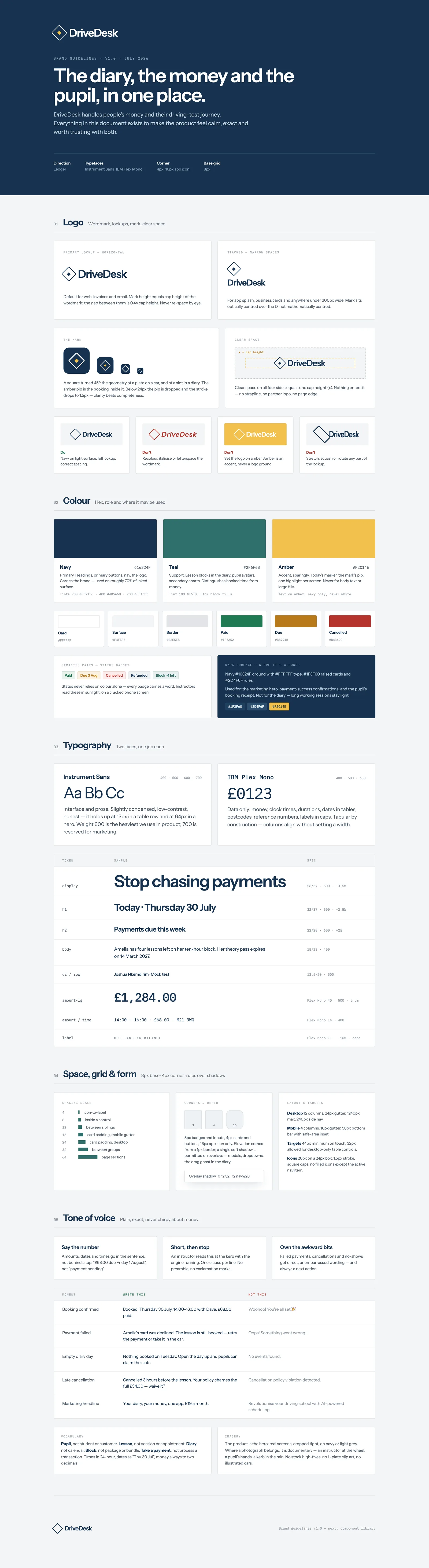
DriveDesk's visual identity should read as trustworthy and unfussy rather than "flashy startup" — the audience is a working tradesperson and their pupils, not other software buyers. A single accent colour (a confident blue, associated with UK road signage and easily legible outdoors on a phone screen in daylight) against a clean white/light-grey base, generous touch targets (minimum 44px, instructors are often using this one-handed or gloved in winter), and a single legible sans-serif typeface used consistently rather than a decorative display font anywhere. No stock photography of generic "happy drivers" — pupil-facing screens use the pupil's and instructor's own uploaded photos wherever a photo appears, or a plain initials avatar if none is set.
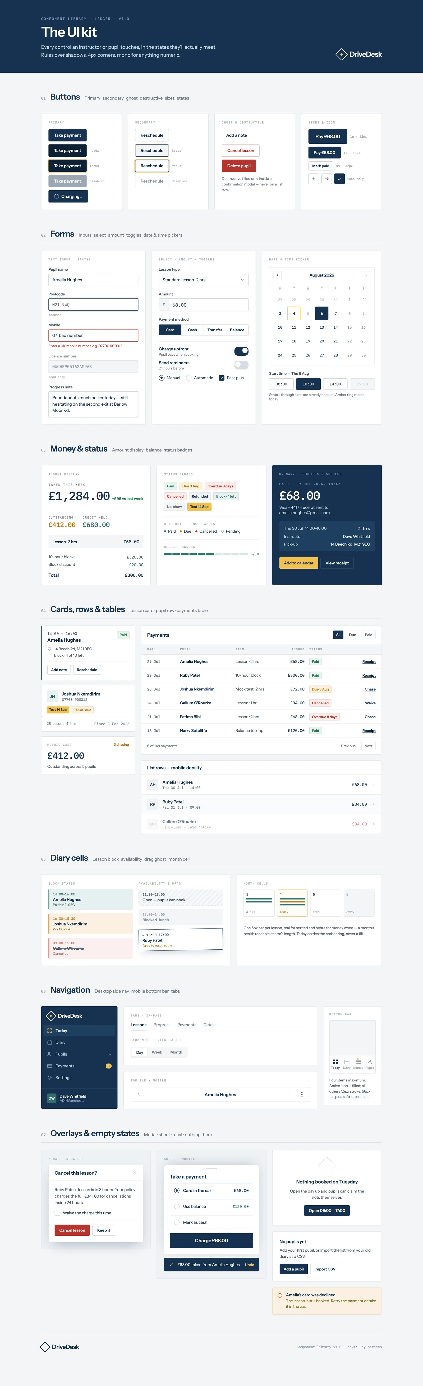
The Design deliverable produces DriveDesk’s own identity — its brand, component library and key screens, in its own visual language, not ours. This is that output. Click any artefact to open it full-size.
Six documents · £8,000 fixed · ~3–4 weeks
Scoped to your real product or internal system — not this fictional one.
Book a Blueprint call Back to overview